
Responsive Design: 3 Easy Ways to Get it Right
Creating a website that looks great and scales seamlessly on mobile devices is increasingly becoming a priority among web designers and developers. After all, having just one version of a website to maintain is simpler than having a separate versions for tablets and mobile phones, and more efficient, as it saves time and money.
Responsive design is not exactly a new approach: many WordPress themes are already based on it, and there are handy WordPress plugins for mobile-friendly websites. Resources such as tutorials, guides and website building tools also exist in large quantities, and can help you dive into responsive design even without any coding knowledge. Here are three easy ways to make sure your website implements responsive design properly, and in a functional, visually attractive way.
1. Use a Website Builder Tool
Online website building tools are usually the best choice for people who need to get a website up and running quickly. These tools simplify the design process and let the user create a website by drag-and-dropping elements (textboxes, menus, buttons, images…), thus eliminating the need to edit HTML and CSS directly.
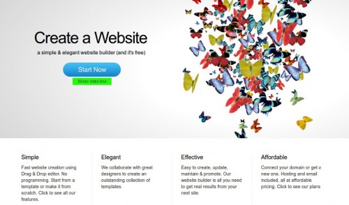
IM Creator is a free website builder of this kind, with a WYSIWYG approach and a user-friendly interface that lets you either shape your own design or choose from pre-made responsive templates. With IM Creator, you can build an entire website in the browser without registering for an account, and only create one if/when you’re satisfied with your creation. It’s free to publish a website, but if you want to host it on a custom domain, you need to purchase a Pro version. It will also let you download and migrate your entire website elsewhere, which is useful once you get more comfortable with maintaining the code yourself. You can use IM Creator for a personal or business website, as a portfolio, blog or product showcase…the only limit is your imagination.
2. Install a Responsive WordPress Theme
WordPress beginners already have it easy – if they don’t want to code anything, all that has to be done is choosing a theme. There are many responsive WordPress themes to pick from, both free and premium. Some offer simplicity and minimalist design, while others let you add widgets, move sidebars, customize navigation and change entire website layouts.
Onion Theme
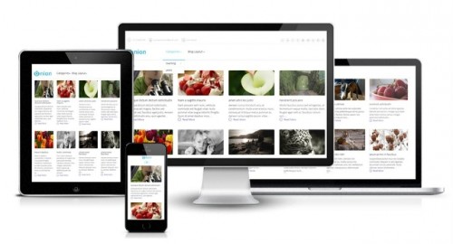
Onion is a responsive WordPress theme with support for more than five different layouts (three, four and five columns, with or without sidebars, full width…) and all the widgets you might need. It includes Google fonts, a custom 404 page, social icons and a sticky menu.
Hueman Theme
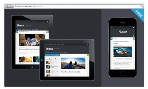
Hueman is perfect for magazines, and it comes with incredibly flexible layout options, as well as advanced color customization. You can place widgets in the footer and enable fixed-width sidebars, set related and featured posts, upload a custom logo and choose from dozens of cool Google fonts.
WP Clear Theme
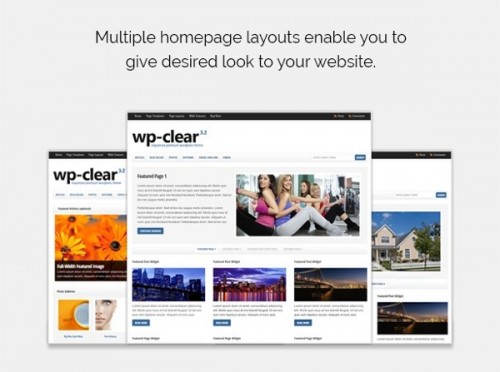
WP Clear was built with professionalism in mind, and it relies on minimalism to send your message across to your clients. You can create multiple post categories and feature them on the homepage, enable drop-down menus and banners, add sliders with photos and videos and create a portfolio page.
3. Make Existing WordPress Themes Responsive
If you want to take the next step and modify existing themes, there are tools to make your life easier. Perhaps you’ve found a great theme, but it doesn’t really work well across all devices, or you’ve installed a responsive theme but you don’t like the fonts it offers. It’s good to know you can change all that with simple online tools, in just a few clicks.
Layers
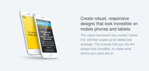
Layers is a free and open source plugin that integrates with WordPress Customize dialogs and lets you modify your website’s appearance. You can reorganize elements by drag-and-drop or choose one of the preset layouts. Adding widgets, customizing content, inserting media and making a special mobile-friendly sidebar is easy thanks to an intuitive, neat interface.
Themify Builder
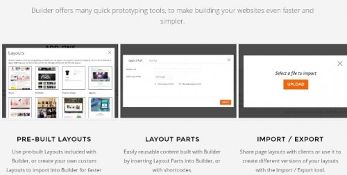
Builder plugin by Themify is a time-saving tool that lets you modify existing (installed) WordPress themes and helps you turn them into responsive, eye-catching websites. You can use it to add Google fonts to your theme, enable parallax scrolling, rearrange widgets, change colors, and even export finished layouts. It’s based on a modular approach, so you can enable add-ons and additional modules to extend its functionality.
Responsive design really doesn’t have to be complicated. Whichever of these three solutions you choose, it will surely help you understand the design process. Who knows, it might motivate you to develop your coding skills so that you can peek behind the curtains and start developing websites independently and with ease.