Responsive Web Designing is Indeed a Prerequisite in 2015 – What Does Google Say?
Smartphones and tablets are gradually taking over the entire scene of web surfing. During the initial part of 2014, the usage of internet on mobile devices officially surpassed the traffic that was being generated to PCs. This is the reason behind the sudden importance and need to have a website that is entirely mobile-friendly, and a multiple-device compatible site that can fit into the brand new digital market. In order to meet this kind of demand, responsive designing has become rapidly common and it has also become the new standard in the web development industry.
Responsive designing – There’s more to it than just being a mobile-friendly site
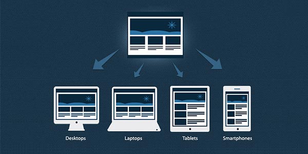
There are many who think that responsive web design is simply making a site that is perfect to be surfed through a mobile device but this is not so. This is an approach to web development using fluid, flexible images, grids based on exact proportions and CSS3 media queries in order to deliver an enhanced user experience through all kinds of devices. Responsive design has more benefits for business organizations that just having a different site that caters to the mobile devices. The design of the website should allow the whole website to adjust to all kinds of devices, thereby delivering a single set of content that effortlessly caters to target screen sizes. Today’s customers expect a responsive website that offers rich information from a business organization.
There are always more expectations from the online visitors
A few years back, it was okay to have some bare important information on your mobile site but now 85% of the online users believe that the mobile website of a company should have as good information as it is for the desktop website. This clearly means that the online visitors want the full experience of the desktop site even when they browse through their smartphones and tablets. The desirable features may range from easy navigation, easy and effortless access to tools like shopping cart, search bar and the capability to perform any action that is intended by the visitor. Most visitors usually first check out your website in their desktop while they’re at work, then they check it out on their smartphones during lunch and then they get back home and check once again from their tabs. So, don’t you think that it will be pretty irritating if your website looks different in all the 3 different devices? This is the reason behind emphasising on responsive design websites.
Fall in loading time and bounce rate
In case your site is not performing well on mobile devices and the online visitors are leaving your page soon after a few clicks, this will immediately lead to high bounce rates. When Google detects this, it will give a lower quality score and rank your site lower and this will lead to a decreased traffic. A responsive website will also reduce the loading time of a page and increase the search engine ranking.
Many of the website designers Sydney universities have in their alumni such experts who believe that responsive designing is nothing but a prerequisite when it comes to facing the mobilegeddon. Hence, take into account all the details to retain your search engine ranking.