Designing An Effective Charity Website: A Primer
While charities shouldn’t be expected to devote large amounts of money and time to designing a great website in the same way corporations do, following a few key rules can help your cause bring in more money. The secret? Aesthetically pleasing web design makes users believe your cause is professional and well run, more so than a shoddy site.
If you’re building a site for a cause you believe in, let that show in the design. Here are 5 basic rules that will make your charity site stand out from the pack.
1. Stay Up To Date
One common web design problem among both charity sites and other organizations is the failure to keep the website up to date. A great website will offer not only a running feed of recent activities and news about the organization, but needs to be consistently kept up to date, like Direct Relief’s website.
When potential donors see what you’ve been up to, and that you are actively making a difference, they’ll be more inclined to donate money to your charity. Out of date news feeds, on the other hand, can instill doubts about your commitment to action and drive benefactors away.
2. Craft A Logo
A logo doesn’t need to be elaborate, but it does need to be unique to your organization and consistently used. If you don’t have the design skills to craft a complete image-based logo, start with choosing a font and color scheme. By using these on all of your emails, appeals letters, and on your website, your charity becomes a recognizable presence in the community. Once you have a basic logo, you can also add it as a stamp on images or otherwise make sure it shows up as an integrated part of your public presence.
3. Point Towards A Goal
A charity website should do many things, and while every organization has multiple concerns at any given time, your front page should illustrate that you’re working towards a specific goal. Many charities find that by putting out a call for donations targeted to a specific action, rather than a series of causes covered by the organization, that they receive more funding.
Put this goal on the front page – you can even include a progress bar. With a visible gauge of success, people will be determined to help you meet that goal.
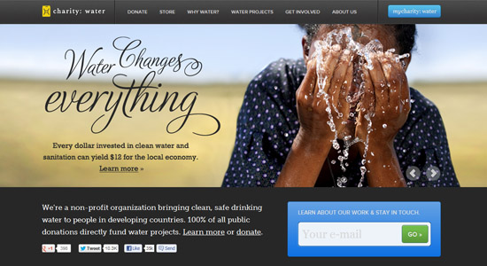
4. Use Photos Prominently
Put a face to your cause. One of the most important facets of a good charity site is ample use of photographs. Make sure that you’re producing high quality photos of your work in the community or region your organization is based – iPhone pictures won’t do for a formal website. You need high resolution, color photos to draw donations for your charity.
5. Emphasize Donation
Finally, the primary goal of your website should be to draw donations, so people need to be able to find the donation button easily. One of the best ways to do this is by not only placing the donation button prominently, but by also putting it in a contrasting color relative to the rest of the site. Using a bright color draws the eyes away from other content and to this function so you don’t lose any donations to frustrated site browsers.
A good charity site doesn’t require elaborate programming abilities or even a background in graphic design. Rather, a simple site will do so long as you emphasize the most important features appropriately. Share your message, show your work, and make it easy for interested parties to help your cause.