Understand the Meaning and Impact of Color in Web Design
Whether you’re about to rebrand or launch an entirely new website from scratch, you should take every facet of the design phase into account. Among other things, you need to pay attention to your color scheme.
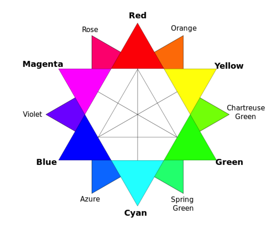
Different colors convey different connotations; you want to make sure you’re sending the right signals to your audience.
The Impact Colors Have on Emotions and Perceptions
Color theory is such a rich topic that some professionals spend their entire career studying how various colors affect people. Though researchers will argue over the impact of certain shades, saturation, and hues, nobody disputes the fact that color can have a profound impact on emotions and perceptions.
When it comes to art, color is of course vital. But when it comes to web design and corporate branding, the difference between one color and another may mean millions of dollars. Most experts believe colors are more important than shapes, symbols, and even words.
According to a study of the world’s top 100 brands, blue and red are the two most popular colors. One-third of the top brands across the globe have blue as one of their primary colors, and 29 percent find a way to incorporate red into the mix.
Nine percent of companies choose to use only colors and shapes, with no text whatsoever. Here’s a look at some of the connotations and relationships associated with certain favored colors:
- Red. Relates to passion love, aggression, and power. It’s a strong color that excites and invigorates.
- Blue. Arguably the most popular of all, blue is calming, dependable, stable, and trustworthy. It puts people at ease.
- Yellow. This bright color evokes positivity, warmth, creativity, and hope. It’s also effective for attracting attention.
- Green. One of the more popular colors for modern brands, green is synonymous with wealth, health, and prosperity. It also correlates with serenity and peace.
- Black. Classy and sophisticated, black arouses sensations of prestige, formality, and timelessness. It’s clean and simple.
- White. Pure, clean, soft, and noble are words that people frequently associate with white. It’s ideal for brands that stand for cleanliness and purity.
Tips for Choosing the Right Color Scheme
So how do you choose the right color scheme when you’re designing a website for your firm? Let’s examine three specific tips:
- Understand your audience. Nothing is more important than understanding your audience and what they want. For example, 42Floors.com, a commercial real estate listing site, uses green and black because they understand their users are interested in growth, sophistication, and success. On the other hand, a website like Brides.com uses black, white, and pink to represent romance, timelessness, and purity. Swapping those color schemes would probably have a negative impact on traffic and sales on both sites.
- Utilize the 60-30-10 Rule. In the design world, the 60-30-10 Rule is highly respected. It says you should use three different colors in a ratio of 60 percent, 30 percent, and 10 percent. This balance enables you to create a clean color scheme that’s attractive and engaging.
- Differentiate from the competition. Finally, you should use a color scheme that separates your brand from the competition without separating your company from the target industry. In other words, use unique colors without alienating the audience you’re targeting and compromising your message. Just because your biggest competitor uses green, that doesn’t mean you can’t. You have to find a unique shade or different combination of colors to stand out.
Connecting the Dots
Color is a critical aspect of web design. Not only can it change the visual appearance of your site, but it has a profound emotional impact on the users who visit.
If you want to maximize conversions and lower bounce rates, think hard about the color(s) before launching your next site.
