5 Homepage Ideas to Promote Conversions
No marketing endeavor should be attempted without a clear goal in mind. For your website, a very popular goal is getting more conversions. If it’s designed professionally, you can effectively lead visitors down the sales funnel and influence the final step in a buyer’s journey.
Many visitors’ first interactions with your website will be the homepage. It has the power to draw in a customer or scare them away. If you’re looking to move people further down the sales funnel, a solid homepage design is a must.
Here are some changes to make if your homepage doesn’t have the proper allure.
- Make Contact Easy
You’ll hardly get a conversion if contact information isn’t clearly displayed. This is most important for local or service businesses who rely on interpersonal interactions. Contact information should be provided in several different places so that customers never have to search for it.
Take a look at this homepage from an Indiana personal injury law firm. They have their contact information clearly displayed in the header, buttons for phone numbers or directions, and a popup window that will take the user to a chat window. Then, they have contact information clearly displayed at the bottom of the page. Placing your contact information in several different areas helps direct customers without too much effort on their part.
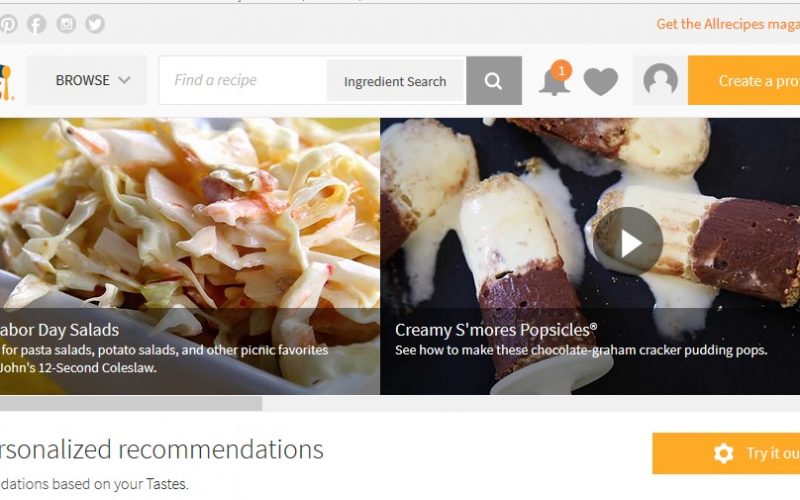
- Add a Search Box
Unless they discovered the value of your business through another source, most visitors will look through internal pages on your website before making a purchase. Facilitate their preference with an omnipresent search box. They can easily find whatever they’re looking for, no matter where they are in the sales funnel.
The search box on Allrecipes.com is a good example of this. By clicking on the search icon in the corner, you can refine your search. Their goal is to gain more subscribers and encourage the following of other users. With a search box that enables visitors to find exactly what they’re looking for, the chances of a conversion rise significantly.
- Create a Clear Call to Action
The call to action tells visitors how to apply the valuable information they’ve just consumed. Many visitors are lost without it. Still, only 47 percent of websites display a clear call to action on their page. The other 53 percent either leave out the CTA entirely, or it takes the user more than three seconds to find it. Three seconds doesn’t seem like much, but it could mean the difference between them sticking around or abandoning your website.
A good website will include multiple calls to action. Consider the Indiana law office example above. Their homepage includes pop-ups, buttons within the top fold of the website, useful links, and detailed content, all of which encourage users to learn more and decide if it’s the right service for them. If an Indiana resident is in need of a personal injury attorney, this homepage is equipped to get their conversion.
- Use Images Without Clutter
Ecommerce homepages are often cluttered with many different elements. The result is a confusing site with an unclear user directive. Imagery should be enticing, but not overwhelming. Instead, keep your images clear and focused with small blocks of text and headers.
Look back at the Allrecipes.com example. Their homepage is loaded with vibrant photographs and recipe titles. There are many different pictures on this page, but this doesn’t overwhelm the reader or make it difficult to understand the calls-to-action. The same principle of good design applies to your homepage. Give your images focus, but don’t let them overrun your content.
- Make the Value Proposition Clear
Although most users visit multiple pages before deciding to make a purchase, the homepage will define a lot for the customer. A good homepage will explain exactly what the company does and the problems it can solve. It will have clear contact information, imagery, and social proof to increase a visitor’s trust.
The Indiana law firm’s website is a good example of this as well. Their page is loaded with information about the law firm and their specialties. It has links to internal pages for more information on certain topics, testimonials from satisfied customers, and images to keep things relevant. Combined with clearly displayed contact information and calls to action, this homepage is a home run for good design and conversions.